Steps to design and develop the first application
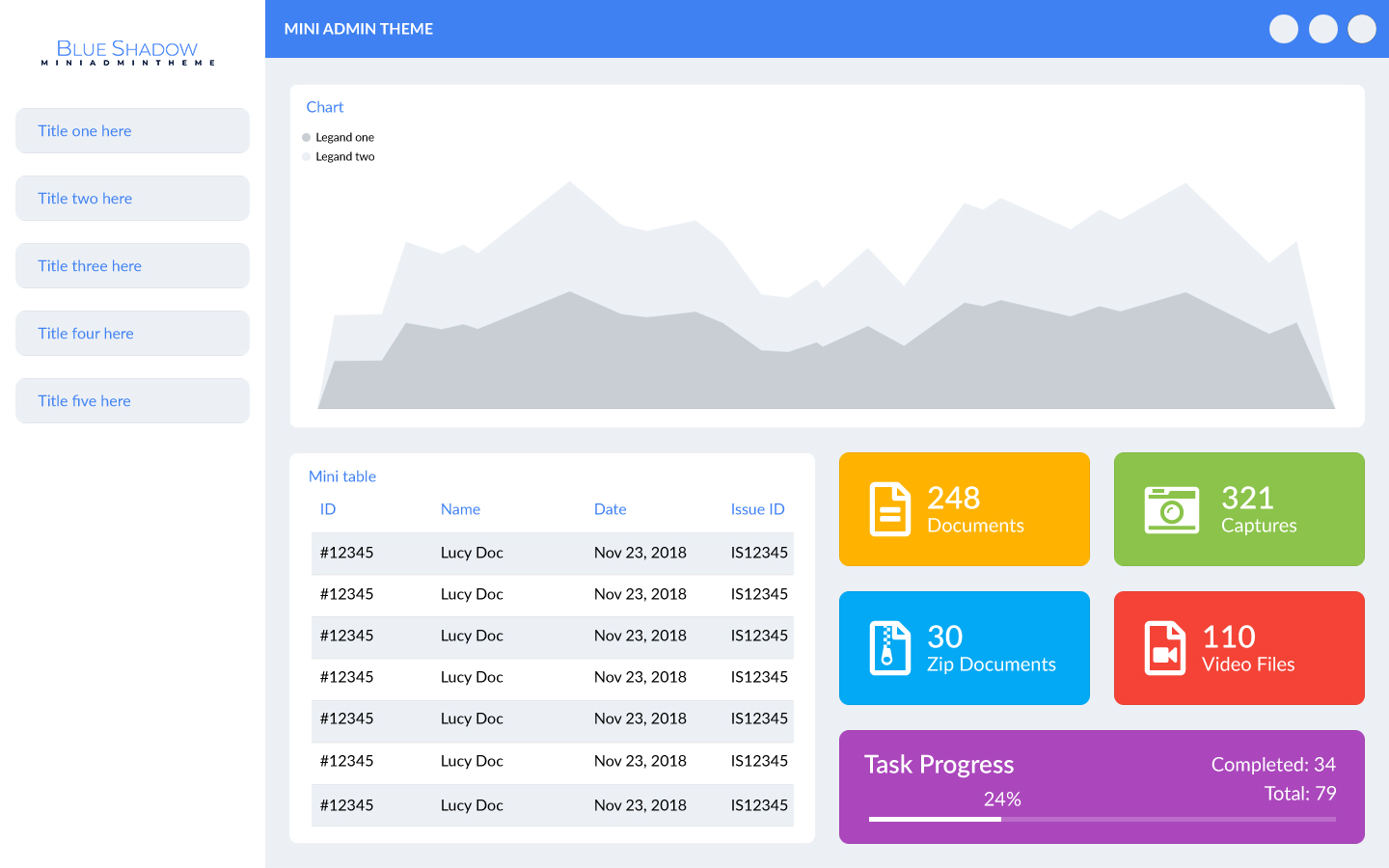
Below image refers the sample mockup of Blue Shadow Mini Admin
Theme
.
This is the sample mockup
to show this methodology. For this example, we shall continue with Adobe Photoshop (.psd).
First you have to draw a sample of low fidelity wireframe for your mockup.
Step 1 - Create the folder structure
Create a folder structure like this
- items
- partials
- level-1
- level-2
- jpgs
- Psmain-app.psd
Step 2 - Divide your mockups to the sections and create psd or ai files
First you have to divide your mockups to small sections. For an example, there are 9 items on that.
- Navigation bar
- Left side panel
- Chart
- Mini table
- Yellow card
- Green card
- Blue card
- Red card
All divided item .psd files or .ai files must go to the items folder as well.
- Pscard-blue.psd
- Pschart.psd
- Pstop-nav-bar.psd
- Pscard-yellow.psd
Note : Please don’t use spaces for your naming on the .psd or .ai files. If you need to separate a name please use – or _ as well. For an example you can write the “card blue” like this. card_blue or card-blue. Please remember this is valid for level-1 and level-2 as well. Otherwise you can’t achieve your file goals.
Step 3 - Level 1 for identify colors, images and gradients
This is the most important part of the methodology. There are two
folders
under partial
folder called level-1 and level-2. This step is to identify each
and every
color
values, images and gradient values as well. Every color, gradients, images you use to
design
your application must go in to this level-1
folder as well.
You have to create each .psd files or .ai files for this color, gradients, images.
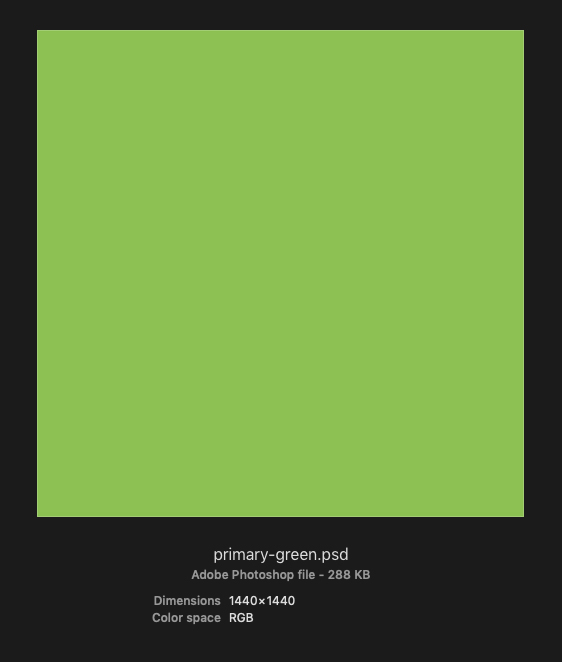
Totally there
are 10 colors in this admin theme. Create your level-1 psd files as a square
psd or ai
file. Better if you can take the width and height 1440px and the resolution is 72dpi and
the
color space is RGB format.
You can use this size for solid colors and the gradient as well.
Note : Please don’t use this size for the images. Use the size what you need for your document. But the format is .psd file or .ai file.
Name your level-1 color psd files like this:- If you have a proper color name as
sky-blue.psd
,navy-blue.psd
, you can choose that names for your level-1 files. - If you don’t know a proper name for your colors, you can use color like this.
primary-blue.psd
,primary-green.psd
,primary-red.psd
etc. - If you have multiple variations of one color, you can name it like this.
primary-blue.psd
,secondary-blue.psd
,primary-dark-blue
etc.
This naming convention is up to you. You can name your images as well as logos, icons on any format as your wish. If you have two types of logos, you can name it “logo-color.psd” and “logo-black.psd” as you like.
- Psblack.psd
- Pslogo-blue.psd
- Psprimary-blue-light.psd
- Psprimary-blue-medium.psd
- Psprimry-gray-dark.psd
Step 4 - Level 2 for identify common or single objects on each section
All the common and single objects of each and every section saved to this folder. First select left side panel as an example for this step. These are the identified main object on left side panel.
- Background color of the side panel
- Tab background color
- Tab title color
- Logo
There are four main
objects and you have to create 4 psd files for those as well. In this step you have to
think the width, height, corner radius, colors, shape as well.
This side panel width is 275px and height is 900px. So, first create a psd file with
this dimension in 72dpi resolution and name it left-side-panel-bg.psd
.
Then create a sample tab psd file. This tab has 10px corner radius. Also, its dimension
is 235px x 45px. So, create a psd file called side-panel-items-bg.psd
and draw a
rectangle with same width and height in this psd file as well. This rectangle corner
radius is 10px.
Tab title is in blue color. Create another psd file and name it as nav-title.psd
.
Create a psd file called app-logo.psd
. So, we have of 4 psd files
for
each object in level-2 folder.
- Psleft-side-panel-bg.psd
- Psside-panel-item-bg.psd
- Psnav-title.psd
- Psapp-log.psd
Note : Name every background as -bg and title
as -title. As an example, leftside-panel-bg.psd
and
nav-title .psd
Note : Please don’t drag and drop any file in to another psd file. You can use this way to link files. In Photoshop Go to File => Place Linked and in Illustrator File => Place.
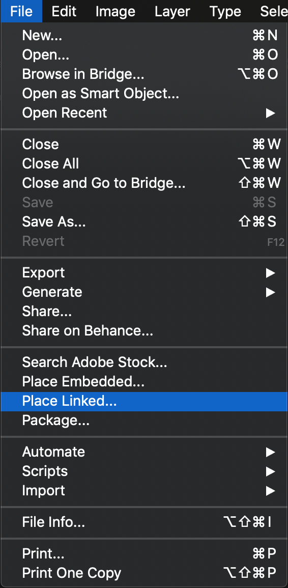 Place link option on Adobe Photoshop
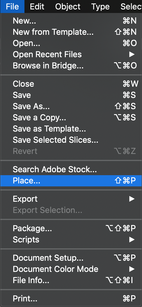 Place link option on Adobe Illustrator
For an example, color of side panel tab is primary light gray.
So, link the primary-gray-light.psd
file to side-panel-items-bg.psd
. But
this tab
has corner radius. So, you have to put the color pasd file from level-1 folder as a mask
of that square shape. If your object has any shapes, put level-1 layers as a mask to
level-2 layers.
Likewise, you can assign matching colors, gradient, and images from level-1 folder to
level-2 folder.
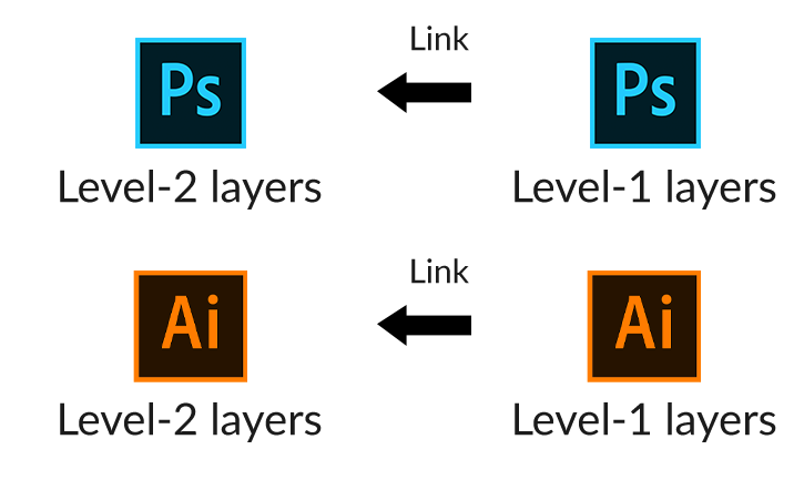
We can create other objects on other sections and link colors from level one as well.
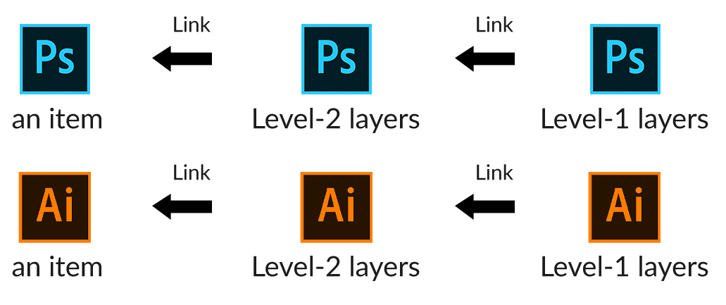
Step 5 – Create an item using Level 2 objects
Now you have level 2 building blocks. According to the example it is left side panel, to create it we need 4 building blocks which build on level 2 folder. Those are,
- Background color of the side panel
- Tab background color
- Tab title color
- Logo
So, open the left-side-panel.psd
file on
item folder.
Link
place level 2 psd or ai files to left-side-panel.psd
.
Type tab titles on there and link nav-title.psd
file and mask it to every
title.
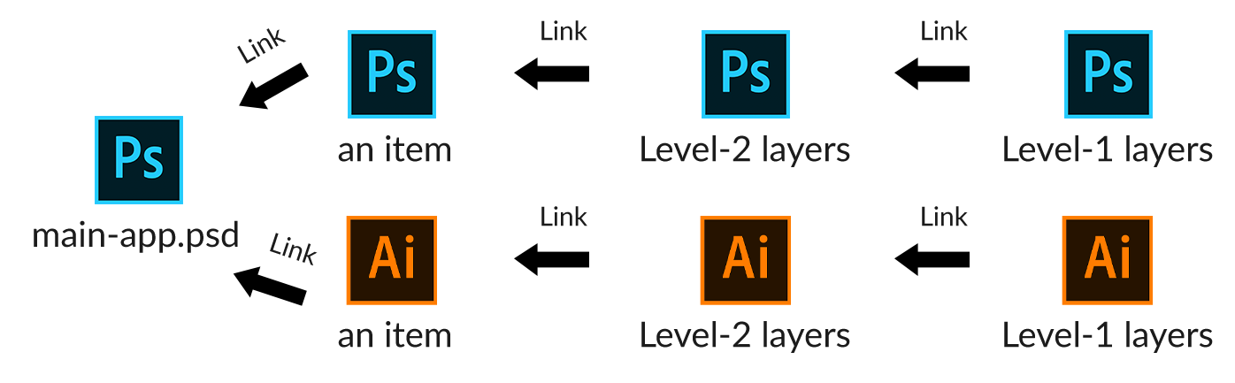
Step 6 – Create main application using items
Now you have bulk of items on your item folder. Each and every
item based on level 2 and level 2 based on level 1 as well.
Now you can create your main application link and place the items, including following 9 items.
- Navigation bar
- Left side panel
- Chart
- Mini table
- Yellow card
- Green card
- Blue card
- Red card
- Purple card
Link all items as we did on previous steps
Step 7 – Create SCSS variables file
Now you can create your SCSS color variables file like this. You
have to follow the same concept to create this color variables file. There are two
sections.
Level 1 section is referring the level 1 colors/gradients and images as variables. You
have to follow this process to write this variable. For an example,
primary-blue-light.psd
is $primary-blue-light as its’ variable. You have to
assign
color values or gradient values or image paths of each and every psd files manually.
Level 2 section is referring the level 2 objects as variables. You have to follow the
same process on previous paragraph to write this variable. For an example,
left-side-panel-bg.psd
is $left-side-panel-bg as its’ variable. You have to
assign
level-1 variables which you created on previously to the level-2 variables as well.
//--------------------- Level 1 ---------------------
$black: #000000;
$logo-blue: url(“img/logo.png”);
$primary-blue-light: #03a9f4;
$primary-blue-medium: #3f81f3;
$primary-gray-dark: #c8ced4;
$primary-gray-light: #ecf0f5;
$primary-green: #8bc34a;
$primary-purple: #ab47bc;
$primary-red: #f44336;
$primary-yellow: #ffb300;
$white: #ffffff;
//--------------------- Level 2 ---------------------
$app-logo: $logo-blue;
$body-bg: $primary-gray-light;
$card-blue-bg: $primary-blue-light;
$card-green-bg: $primary-green;
$card-purple-bg: $primary-purple;
$card-red-bg: $primary-red;
$card-yellow-bg: $primary-yellow;
$chart-area-bg-dark: $primary-gray-dark;
$chart-area-bg-light: $primary-gray-light;
$chart-bg: $white;
$left-side-panel-bg: $white;
$nav-title: $primary-blue-medium;
$notification-icons-bg: $primary-gray-light;
$side-panel-items-bg: $primary-blue-medium;
$table-bg: $white;
$table-header-title: $primary-blue-medium;
$tr-even-bg: $primary-gray-light;
$tr-odd-bg: $primary-gray-dark;
$widget-title: $primary-blue-medium;